The meaning of colour. Until I started really digging into the world of design, I didn’t think much about how colour made me feel. I knew I reacted to different colours in different ways but I never tried to define it.
Now that colour is part of my business, I’m paying a lot more attention. The colours used in websites and logos have a direct impact on how people see you.
Getting those colours right can boost your business. Getting them wrong can turn people off before you even get a chance to talk to them.
Here are some things I’ve learned and how I’m applying them for my Pink Toad Studio clients.
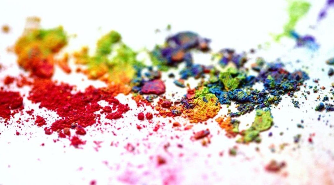
What an amazing variety!
When you really think about colours, the range and variety is astounding. All the colours in the rainbow and then some.
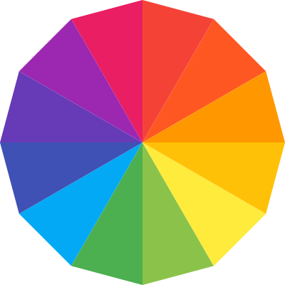
There are the primary colours – red, yellow and blue.
Secondary colours like orange, green and purple created by combining primary colours.
Tertiary colours combine a primary colour with a secondary colour.
Colours even tell temperature! Warm colours in the red-orange-yellow range. Cool colours in the blue-green range. And some in-between like purple which combines the warmth of red and the cool of blue.
There are bright colours and pastels. All variations of a base colour.
Then we round out the list with neutrals – blacks, whites, tans, navys…
There are shades and tints for all these colours, too. Shades are a colour mixed with white. Tints are a colour mixed with black.
Then there are tones that combine a colour with grey for a another interesting variation!
No wonder choosing a colour pallet for your business can be daunting!
And, how about how they make you feel…
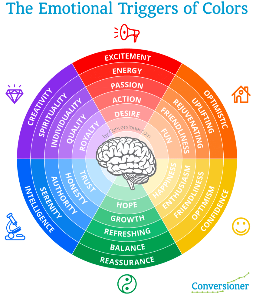
Did you ever wonder why businesses in the ecology industry often use green as one of their colours? Because it makes you think of hope, renewal, nature.
Red is seen as bold and daring. Think Virgin and Coca Cola.
Blue is a standard for companies with authority in their field.. IBM, WordPress, Facebook. According to Review42, 33% of top companies use blue in their logo.
Orange gives off a friendly, confidant vibe.
Purple? I think creative luxury. How about you?
Black, even though it’s a neutral, has a feeling all its own. Use it to show sophistication and mystery.
What about the pink in Pink Toad Studio? It’s intended to show that I’m insightful, fun-loving, optimistic and caring. How do you think it does?
Mix and Match
One colour likely isn’t enough to show your business brand at its best. You’ll want to find a supporting cast. There are a few routes you can take…
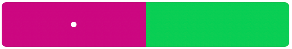
- Monochromatic – lighter and darker versions of your original colour
- Complementary – two colours opposite each other on the colour wheel
- Analogous – three similar colours beside each other on the colour wheel
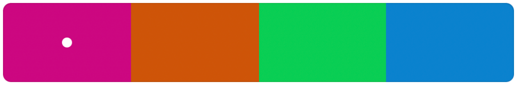
- Triadic – three colours evenly spaced around the colour wheel
- Tetradic – four colours spaced evenly around the colour wheel
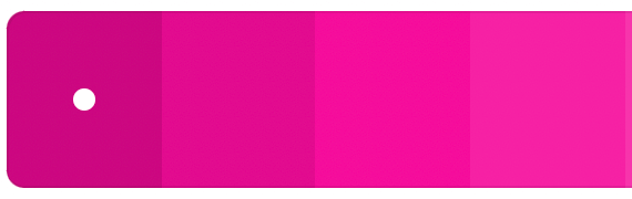
Here are the different pallets using Pink Toad Studio pink:
Monochromatic
Complementary
Analogous

Triadic

Tetradic
The wonderful thing about writing about topics like the meaning of colour is that you get to learn something new yourself. This time it was tones – I had no idea that it was grey added to a colour. Crazy.
Not sure why your colour choices matter? Here’s a blog post about The Brand Kit Process. It explains what a brand does for your business.
Maybe you’ve got your colour-geek on and want to know more? Here are a couple of resources I love to get you started on your colour journey…
- Smashing Magazine’s Colour Theory for Beginner’s Part 1
- Canva has great information on colour theory
Happy colouring!