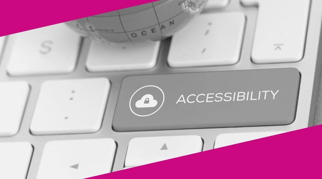
Is your website ready for the new accessibility rules that came into effect on January 1, 2021?
15% of the population worldwide have disabilities according to the United Nations. Making your website accessible could help someone find the help you offer. Making your website accessible will open you up to a whole new audience.
WordPress has been working hard to make sure that all website visitors can access information. Not everyone can point and click. People use just a keyboard, screen readers, screen magnifiers, head pointers and voice recognition to name just a few tools.
Interestingly, a lot of the accessibility guidelines are good SEO (search engine optimization) practices, too. And better SEO means more visitors to your site!
Here, in plain English, is what you should know if your small business has a website. Or if you are creating one in 2021. And don’t worry – it’s not so bad! A lot of it is just common sense.
You don’t have to implement all of these rules at once. If you already have a website on January 1, 2021, you can work on updating it as you make other changes.
Who has to comply with the new rules?
The guidelines differ by country and region. A good rule of thumb is that, if you have a website, you should be following as many of the guidelines as possible. That way you’ll be ready when the rules do officially apply to your business.
A quick Google search on “web accessibility [enter your country, region or city here]” should help you figure out if you are required to comply.
What are the new accessibility rules?
The guidelines fall under 3 categories – perceivable (how people see and hear content), operable (how people move around your site) and understandable (how easy it is for people to read and understand your content).
How people see and hear content (Perceivable)
Images
- All images on your website should have the “Alternative Text” filled in. This helps screen readers describe the content to people with sight issues.
Video and Audio
- Use captions on video or audio clips for those who can’t hear the content or are using a screen reader.
- If you can, add an audio description to videos.
- Where possible, offer content in different ways. Offer a blog post as an audio clip or a written transcript for a video or audio clip.
Make it easy for everyone to get around your website
- Icons should have a text label so they can be identified by screen readers.
- Make sure your content is organized in a logical sequence to someone listening to it can follow along.
- Your website should work in landscape or portrait mode. Not everyone has the option of flipping their tablet to suit your website. Your website should adapt to them.
- All input fields should have a clear label. Things like Name and Email on a contact form. This makes it easy for screen readers to tell people what’s expected in that field.
- Any pop-ups should be “clearable” using the keyboard – not just by clicking the “X” in the corner.
Use colour and contrast to help users with impaired vision
- The colours on your website should provide enough contrast to make it easy for a person with limited sight to distinguish between the different elements of your site.
- Colours should not be used as the sole means to divide the information on your page. Some people don’t see colour so your content should work in black, grey and white, as well.
- Visitors to your website should be able to resize the text up to 200%.

How people move around your website (Operable)
Make your website keyboard-friendly
- Visitors to your website should be able to get around using just the keyboard.
- If people need to use a specific key sequence to do something on your website, make sure it’s clear to them.
- Let people turn off or remap custom keyboard shortcuts. Or make them active only when a specific field or image has focus.
Let users control time
- Don’t place time limits on anything a user might do unless they can turn it off or adjust it.
- If anything automatically moves on your website, give people a way to pause that movement.
Save your users pain
- Be aware that anything that flashes on your website can trigger headaches and seizures in some people. If it has to flash, it shouldn’t flash any more than 3 times per second.
Some user-friendly navigation tips that work for everyone
- Visitors to your website do not want to read or hear the same content at the top of every page. For example, if you have repeating information about a sale on each page of your website, provide a link so the user can skip that section and jump directly to the content. Hopefully they’ll stop and read it on at least one page!
- This is kind of a given but, make sure your pages and section headings have a relevant title.
- If there are links to other pages or websites on your website, make sure they have a name that tells where you’re actually heading for – not just the https://anyplace.com/somewhere/ address.
- Give visitors several ways to access a web page. From the menu and from a link, maybe.
- If people need to follow a path to get somewhere on your website, make sure the points on the path are separate. Don’t make someone drag their finger or a pointer to the next option. Not everyone has a steady hand!
- If any of your website requires a user to do something like shake their device to erase something, have some way that it can be disabled. Not all motion is intentional…
How easy is it for people to read and understand your content? (Understandable)
Make sure you’re understood
- Make sure your content is easy to read for your target audience. Follow the basic rule – keep it simple. But not to the point that it’s not clear! A tool like the Hemingway Editor can show you what reading level your writing is at and how to improve it.
- Anyone with a “lower secondary education” should understand your content. If necessary, add explanations, diagrams and images to make things clear.
Consistency is key!
- Be consistent! All menus should behave the same way and go the same places. A Contact Form should be called a Contact Form wherever it appears.
Make sure your message is clear – and that you heard THEM
- If you show an error message for any reason, make it clear what the error is and where it is.
- If you ask people to enter information on your website, provide clear instructions on what goes where.
- Let people know if they successfully submit information.
- Help your website visitors. Make help easy to find. Provide spellcheck and suggestions for text input if you can. Show an example of formatting for input.
- Prevent problems by checking data entered by people to make sure it’s in the right format. If it’s not, give them a chance to fix it. Where possible, show the user exactly what they’ve entered and ask them to confirm that it’s right – or give them a chance to change it!
Now, not all of these rules will apply to your website. If you don’t have a “shake to erase” option, don’t worry about that one. Don’t know how to add an audio description? That’s okay. The intent of all of this is to make websites easier to use for everyone. As long as you’re making a reasonable effort it should all be good.
Don’t let these new rules for accessibility scare you. If you hire someone to create a website for you, make sure they’re going to use these guidelines. If you’re doing it yourself just pay attention. Even something as simple as adding Alternative Text to every image can be a great start.
Want to know how “accessible” your website is? You can run a check at Site Improve. They’ll email you a report that tells you where your website is good and what can be improved.
Have more questions or want more detail on these guidelines? You’ll find all you want and more from the W3C (World Wide Web Consortium) Web Accessibility Initiative.