Why are fonts important? They carry your message from your website to your customers.
Yes, the words in your message are important. But the font can change the tone of those words.
Think of a word like “memory”. Written in a wonky font like HitchCut, “memory” makes you think of being forgetful. Written in a more formal font like PT Serif, it makes you think of maybe improving your memory.

What is a Font?
A font defines the shape of letters or symbols. They can be different sizes and have styles like bold and italic.
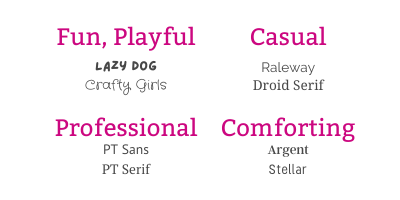
There are standard fonts like Open Sans and Arial and old-fashioned ones like Times New Roman and Courier. Then there are fun fonts, too, like Lazy Dog and Crafty Girls.
Fonts Have Feelings
Fonts, like colours, can be fun and playful, serious, professional, casual, or comforting.
Picking the right font to convey the feeling behind your message can be a big part of connecting with your audience.

Is One Font Better Than Another?
Better? Not really. But some are more readable than others. That’s an important consideration for a website.
It’s nice to have variety within a font, too. A font that comes in different flavours of bold or italics will give you more freedom in your writing by letting you change things up.
Obscure fonts aren’t all that great for a website – unless it’s part of an image. If your web browser doesn’t have access to the font you’ve chosen, it will substitute another font. Then you won’t have any control over what it looks like… not good.
The Good, the Bad, and the Ugly
Helvetica regularly tops the list as one of the most popular fonts. It’s easy to read and looks good in all its forms.
Comic Sans is said to be the most hated font. Some say that it’s hard to read and is unbalanced. Not sure I entirely agree. I think it has it’s place – just not everywhere.
You’ve seen ugly fonts. The ones that are so ornate that you can’t read them. Unreadable fonts do not belong on any website – or anywhere else for that matter!
How Many Fonts Should You Use on Your Website
Most websites need a maximum of 3 fonts. One for the headers, one for text, and a fancy one to stand out.
The headers and text fonts can be san serif or serif or a combination of the two. Websites like FontPair.co have examples of ones that work well together.
Your stand-out font can be a script or calligraphy one. Something bold and dramatic. It’s not for use everywhere. The main thing to remember is readability.
Want to know more about the technicalities of choosing fonts? Here’s a great, in-depth article from Smashing Magazine.
Like colours, I love choosing fonts for websites – it’s a geek kind of thing, I guess. What about you? Do you have a favourite font? Or one that you will never use? Comment below or email me at amanda@pinktoadstudio.com, I’d love to hear about it!


